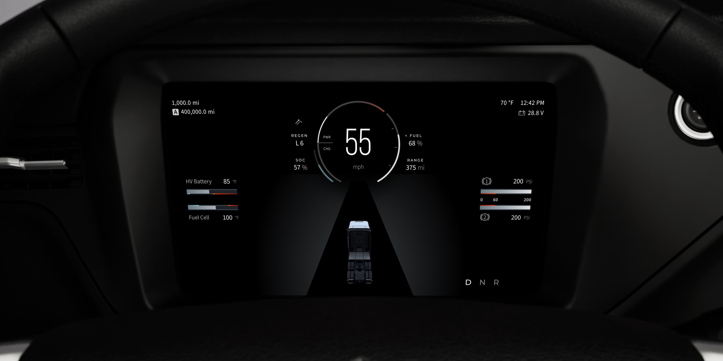
power and fuel level gauge
Empowering drivers with a deeper understanding of the product’s cutting-edge engineering, enabling enhanced uptime and bolstered safety.
ROLE
UX Designer
CONTRIBUTIONS
User Interviews • Contextual Inquiry • Usability Testing • Competitive Analysis • High-Fidelity Mockups • Stakeholder Presentations • Training Material
Overview
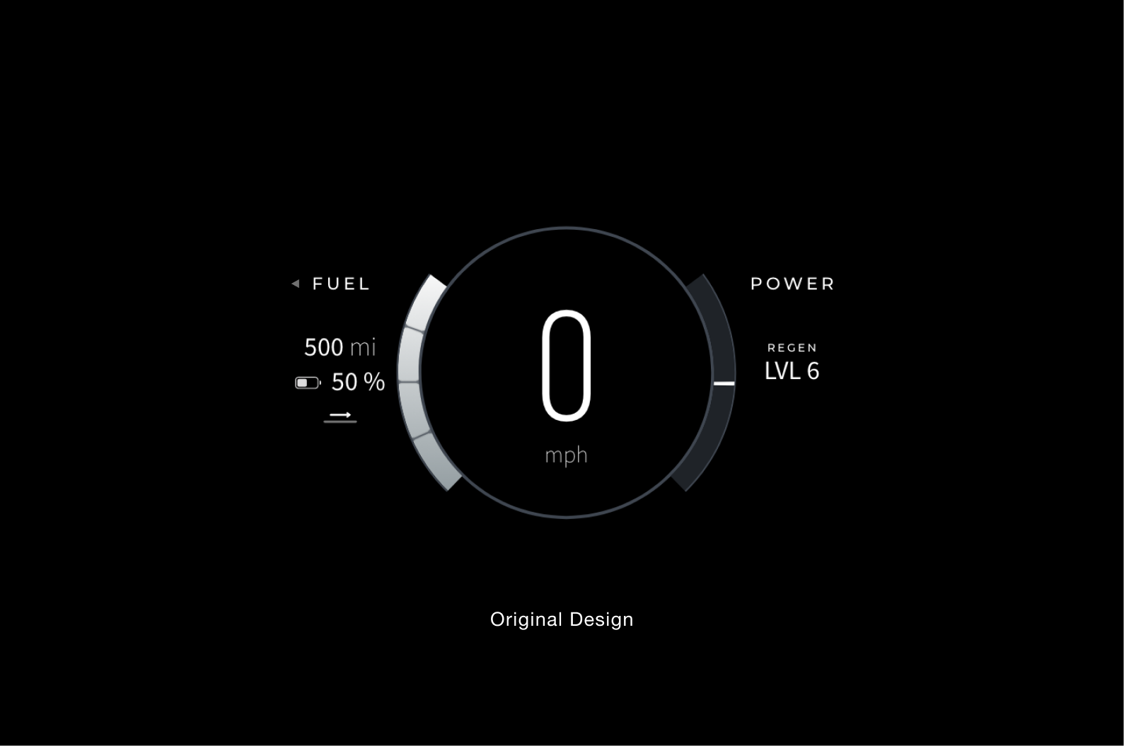
Upon joining the HMI team I was enthusiastic about advocating for user research as time and resource constraints for the initial production launch restricted the capacity to do so. However, the post-production phase presented an invaluable opportunity to leverage both customer and internal fleet feedback, enabling us to gain insights from those actively using the trucks in real-world conditions. One of the issues that surfaced early on was a critical gap in understanding the unique powertrain characteristics of the FCEV product that wasn’t accurately depicted to the driver through the interfaces. This lack of clarity was causing unnecessary downtime as well as safety concerns. The misrepresented and missing information, essential for drivers, highlighted a key area for improvement in the fuel and power gauge, so I proposed utilizing our internal HMA (High Mileage Accumulation) drivers’ experience and knowledge to further understand the gap and to provide a comprehensive solution.
process
Phase 1: Research & Concepting – Gather insights, conduct interviews and observe usage with internal drivers.
Phase 2: Iteration 1 – High-fidelity mockups & initial internal testing.
Phase 3: Cross-Departmental Collaboration – Present designs and UX value across departments to secure buy-in and ensure that the design direction aligns with their goals and constraints.
Phase 4: Handoff & Monitoring – Handoff to development and QA on the bench and on trucks.
Phase 5: Release – Design training assets for customers to ensure a smooth transition to the udpated designs.
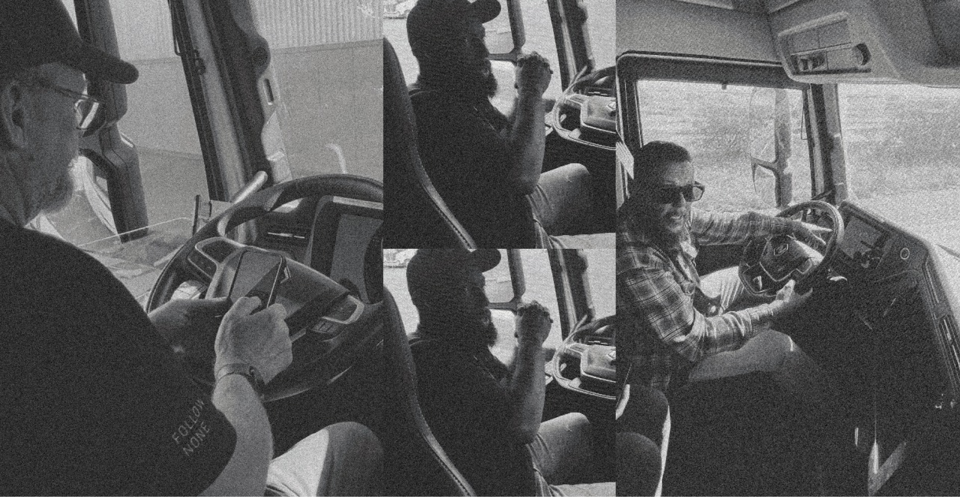
driver interviews and observation
Our HMI product manager and I teamed up to interview and ride along on hour long loops around the Nikola Manufacturing Facility with a variety of drivers. Many had years of experience and millions of miles clocked driving OTR and others with dreyage experience at the port in LA.
Across the spectrum of driver experiences, we identified confusion regarding certain elements of the gauge, as well as missing information that was available in the infotainment system. This posed safety risks, as diverting attention from the instrument cluster while driving is hazardous and could even lead to penalties for drivers. Additionally, there was a general sense of visual overload and excessive stimulation within the cluster itself.
Opportunities
Opportunities

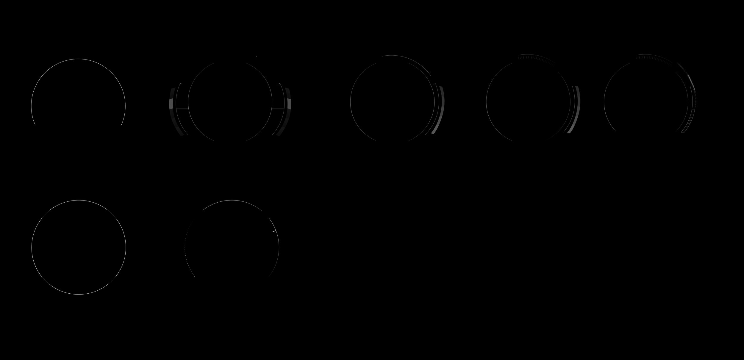
hi-fi explorations
With all that we had learned up to this point It became obvious that to improve user experience, we needed to more clearly represent the relationship between the powertrain components, making it easier for users to understand how different systems interact.
Finding the right balance between incorporating additional information and maintaining clarity required me to reconsider and explore approaches that aligned with our core strategy of reducing cognitive load, while also ensuring consistency with the existing design of other features on the cluster.


IMPROVEMENTS
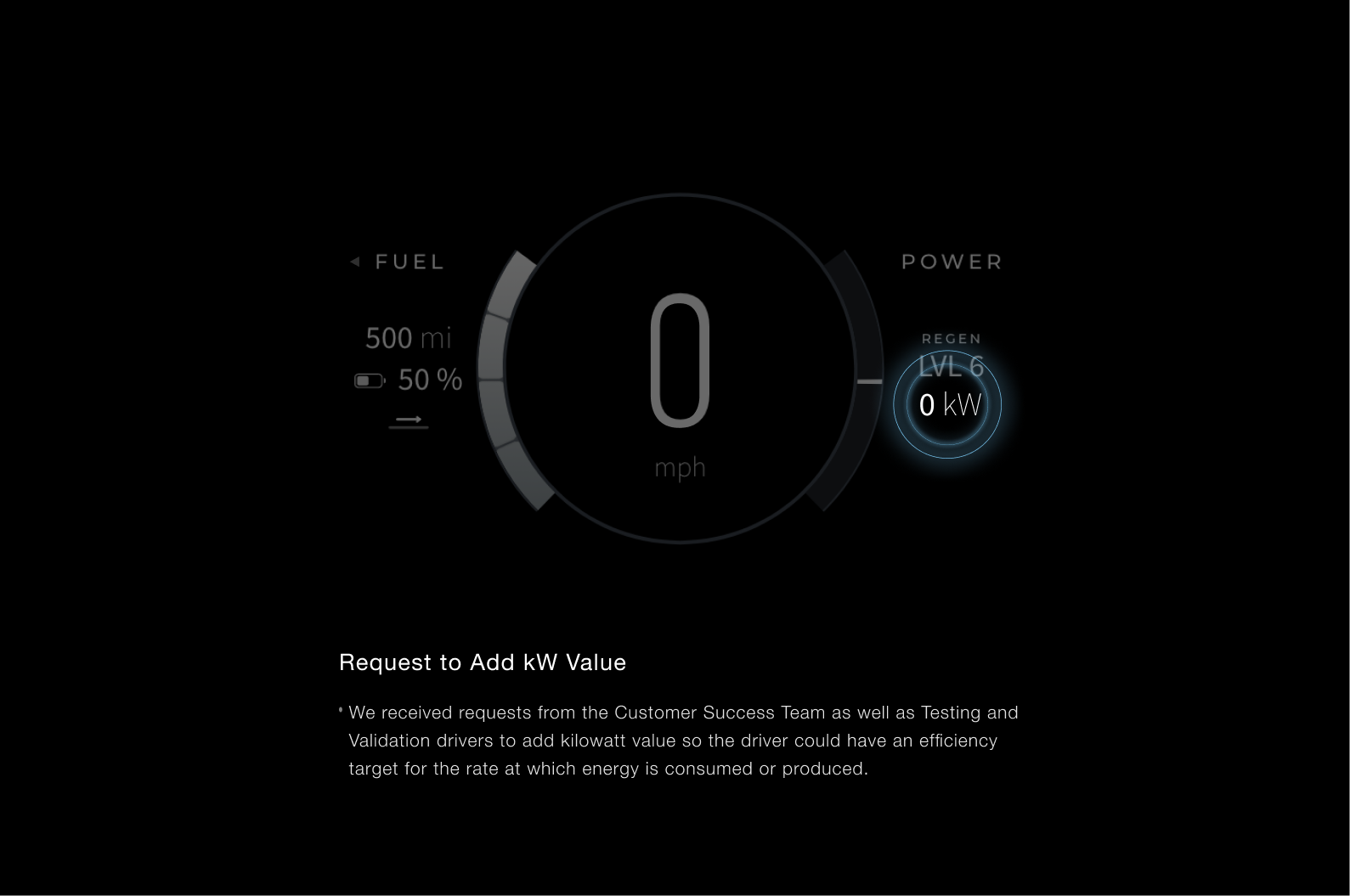
Added clarity by labeling every value separately, including power and CHG for regen.
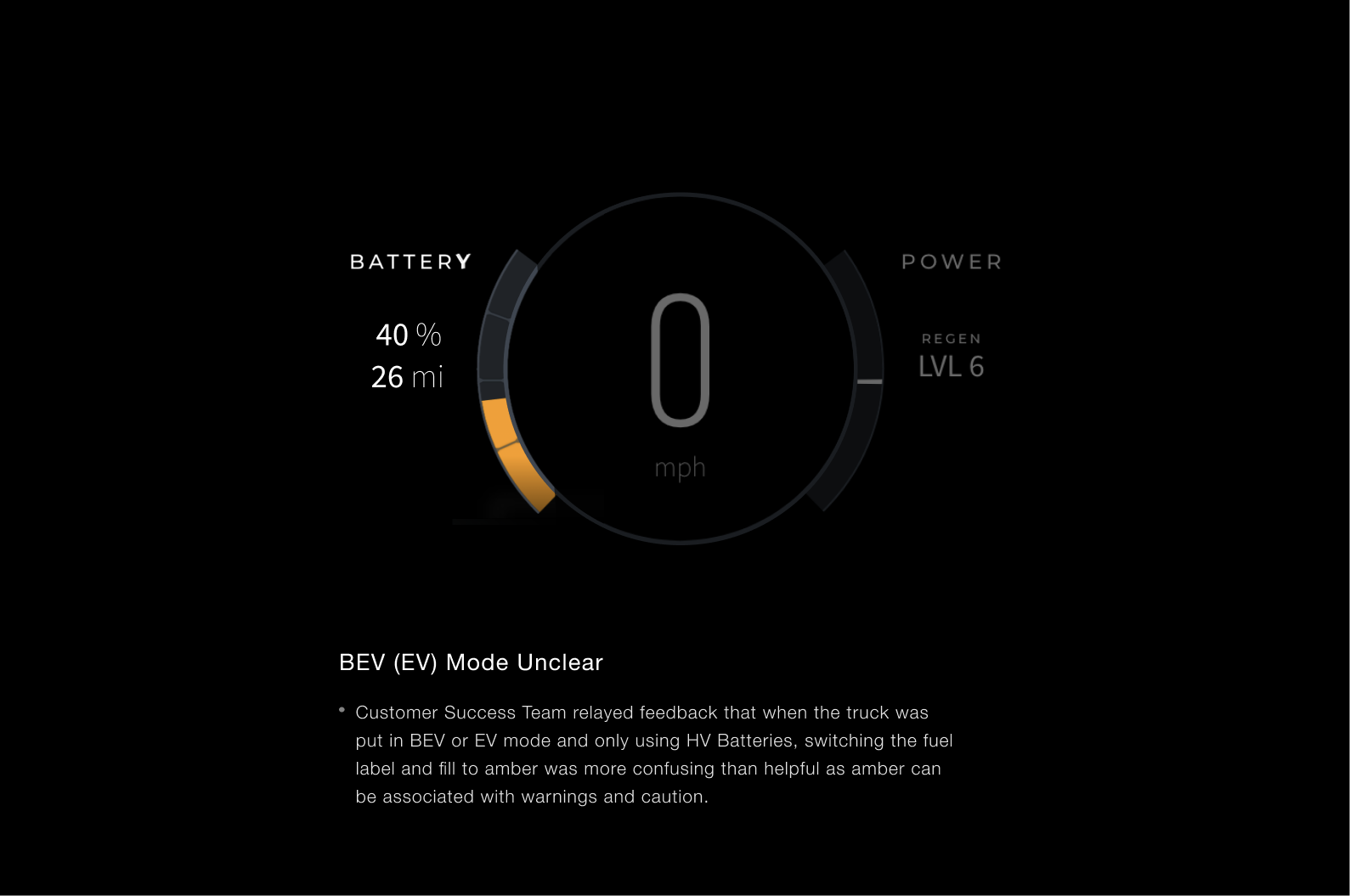
Enhanced the SoC (State of Charge) visualization for greater impact and readability by adding an arc with segmented divisions and adjusting the color scheme to indicate regenerative braking.
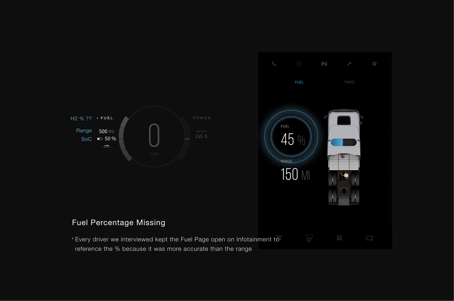
Added Fuel percentage.
Adjusted the position and travel of the power gauge to align with industry norms.
Added redline zone showing when the vehicle is using more energy than is optimal for efficiency, or approaching the system's power limits.
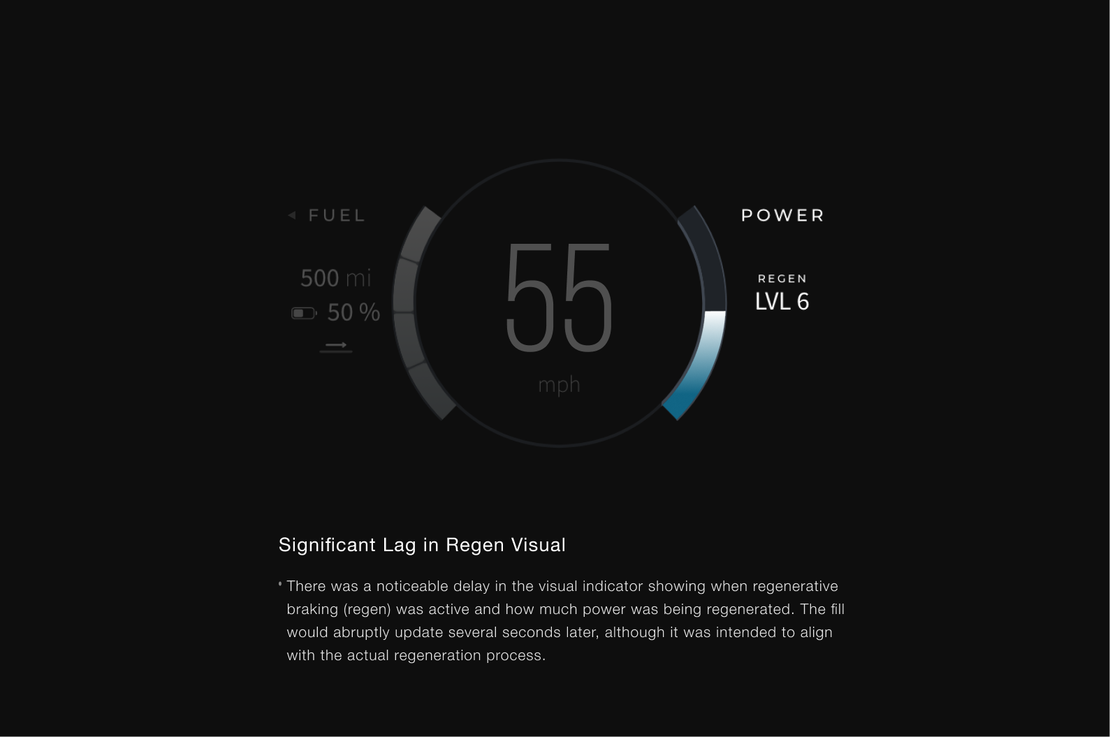
Removed filters on regen that were causing lag.
Adjusted and balanced all visual elements to clearly represent hierarchy and minimize unnecessary distractions.
Final Design


here we goooo

The team agreed on a design and we put it in front of drivers and customer success for feedback. The response was positive and in full agreement that all the changes made were impactful, much needed improvements. The only concern was the change in the width of the fuel level arc and how visible it would be in the truck, which we were planning to asses and adjust if necessary before the release.
cross department collab
With our rationale, findings from users, and validation from feedback we presented designs and UX value across departments to secure buy-in and ensure that the design direction aligns with their goals and constraints. Once all was well across teams we presented designs to be tasked out and I began assisting with development.
handoff and development
I collaborated closely with the VHU development team to support implementation by assisting with arc angle calculations, alignment adjustments, and necessary visual refinements for optimal performance, while also providing detailed QA notes.
