infotainment
The Infotainment offers real-time vehicle health status monitoring, trips data, intuitive controls and truck-specific routing on navigation.
ROLE
UX Designer
CONTRIBUTIONS
User Interviews • Prototyping • Contextual Inquiry • Competitive Analysis • High-Fidelity Mockups
Overview
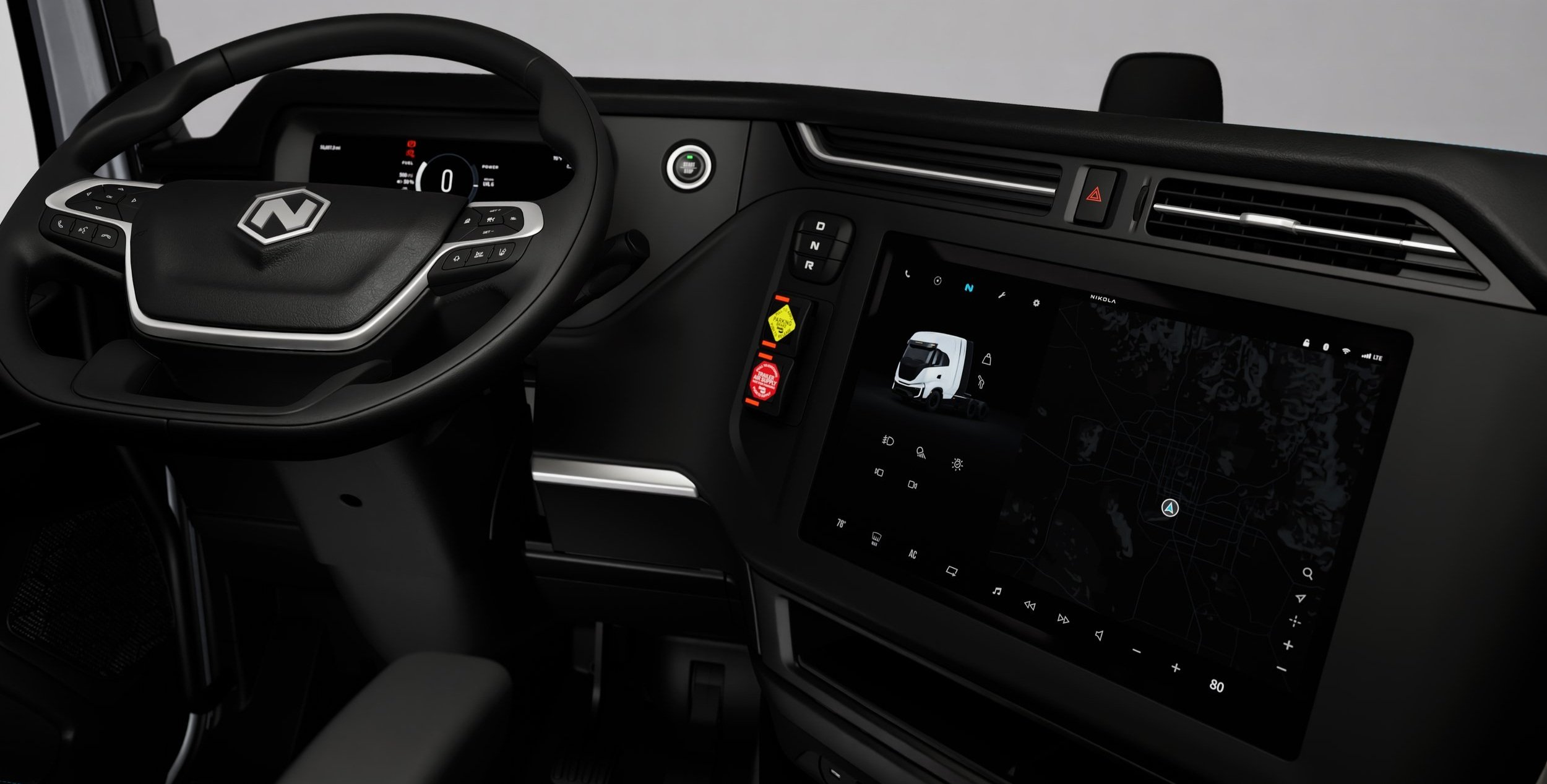
The infotainment screen serves as a secondary interface, providing users with easy access to essential controls and features like climate settings, navigation, media, and other customizable preferences. After over a year of adding new features, refining designs, riding with drivers, conducting interviews, and collaborating with the software team, I gained a comprehensive understanding of the unique challenges drivers face with a nearly all-digital interface in a semi-truck. There were fundamental areas where the user experience could be significantly improved—issues that could be resolved by refining the information architecture and rethinking the layout to create more intuitive, seamless flows within key interaction zones. By making these adjustments, we could enhance both usability and efficiency, ensuring that drivers could access the information and functions they needed with greater ease and safety.
challenges
The absence of physical buttons on our instrument panel means that certain functions, like HVAC and temperature control (which are typically managed through physical knobs or switches), are now integrated into the infotainment system.
However, the lack of tactile feedback for these controls can be less than ideal, especially since adjustments might need to be made while driving, which could pose safety concerns. This improvement aims to address that challenge as effectively as possible, given the constraints of a fully digital interface.

AREAS of IMPROVEMENT
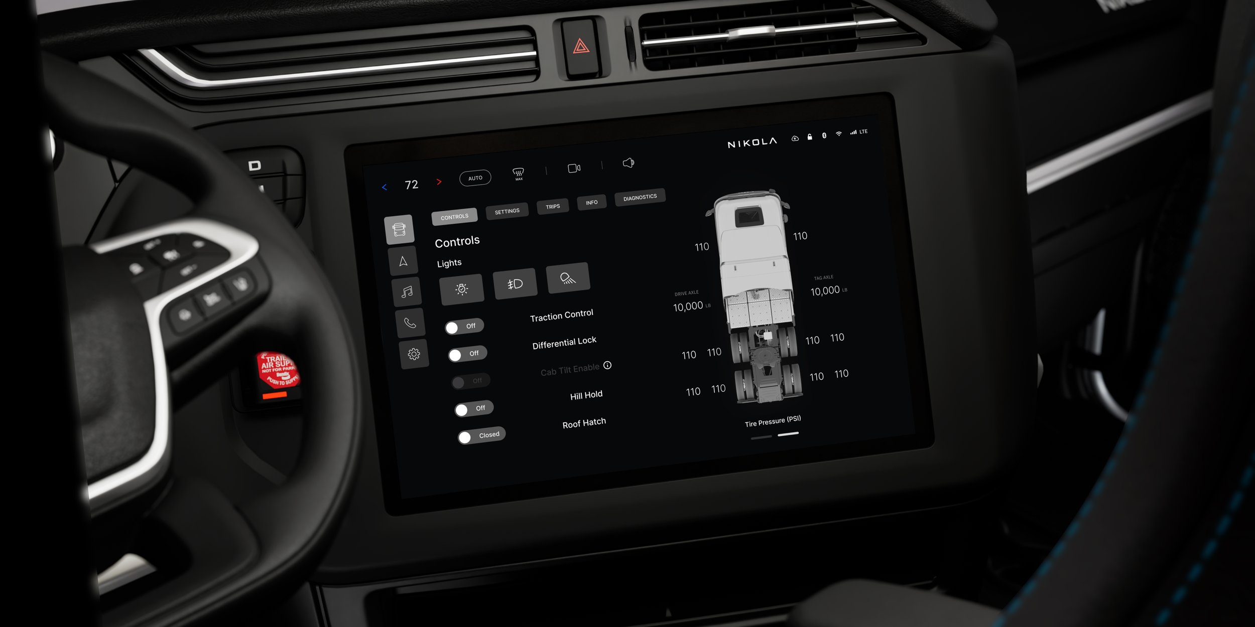
Information Architecture: The redesigned IA prioritizes high-frequency interactions like temperature control, camera, and volume by placing them at the top layer. Features were reorganized into intuitive categories for better accessibility. A vertical navigation layout replaced the horizontal structure, reducing reach effort for drivers.
Screen Utilization: The new layout dedicates the entire 17.4” screen to high-value interactions, eliminating unnecessary multi-fold scrolling. Larger font sizes and touch targets enhance readability and accessibility, ensuring drivers can interact with the system without excessive focus shifts.
Hierarchy and Accesibility: Depth and context were introduced through layered visual styling, making interface sections more distinguishable. Icons and buttons are now contextually grouped, reducing cognitive load. The hierarchy emphasizes critical driving-related features, ensuring clarity in high-pressure situations.
Scalability: The redesign establishes a robust framework that seamlessly adapts to upcoming platform capabilities. Shared design patterns minimize redundancy, enabling a consistent user experience across all vehicle models.
Over-The-Air (OTA) Updates: With OTAs occurring less frequently than initially planned, we faced the challenge of making the most out of every update. We needed to ensure that each update delivered substantial improvements, optimizing user experience without the luxury of frequent releases.
Information architecture
The most challenging—and rewarding—part of this concept is reevaluating the interface architecture (IA). With the content now more stable after the launch of both BEV and FCEV models, we’re in a prime position to reassess the layout based on how drivers actually use the truck. This gives us the opportunity to optimize the interface for real-world driving conditions.
The key questions are: Which features are truly essential while driving? and Which are used most frequently? Understanding this allowed me to prioritize the most critical functions and ensure the interface is as intuitive and efficient as possible for drivers on the road.

SITE MAP
I developed a detailed site map to gain a clear understanding of the design’s structure and to visualize how different controls were being utilized. This allowed me to identify which features were being accessed during critical driving moments, in high-pressure timeframes, and while the vehicle was stationary. By mapping out these interactions, I could better assess the depth and flow of the design, ensuring we prioritized the right elements for optimal usability.

To thoroughly understand what works and what doesn’t in a fully digital infotainment system, I mapped out wireframes inspired by a curated selection of designs from leaders in the passenger car industry. I had attended the LA Auto Show just before starting this project, immersing myself in a wide range of experiences. This gave me a fresh perspective on the patterns I had encountered—innovative, familiar, and exceptional designs that stood out not only for their functionality but also for being a joy to use.
exploratory comp analysis
first iteration testing - wireframes and simple prototypes

I found that taking the time to recreate these designs was invaluable in helping me fully understand the details and patterns behind these thoughtful, innovative, and time-tested systems. It gave me a deeper appreciation for their structure and functionality. From there, I adapted several layouts to fit the specific dimensions of our product, creating variations we could test to determine what would work best for our application. I also built simple prototypes to showcase different layer structures for feature prioritization, then presented them to internal teams for feedback and insights. This hands-on approach helped refine our direction and ensured we were aligning with both user needs and technical constraints.
As expected, the feedback showed that a mix of elements from different versions worked best. It was ideal for drivers to have easy access to both primary and secondary navigation without needing to backtrack or remember where they left off. Additionally, simplifying the information presented at any given time was seen as crucial for keeping the interface clean and focused.
insights
SCREEN UTILIZATION
By removing the dedicated space for the map, I was able to fit three separate pages of critical information and controls onto a single page, reducing the need for the driver to navigate between multiple screens.
Initially, it was assumed that a significant portion of the screen, about two-thirds, would be dedicated to navigation. However, through further analysis, we’ve found that navigation isn’t as heavily used as anticipated. Additionally, allocating only a third of the screen for other interactions often led to excessive scrolling and cramped visual space.
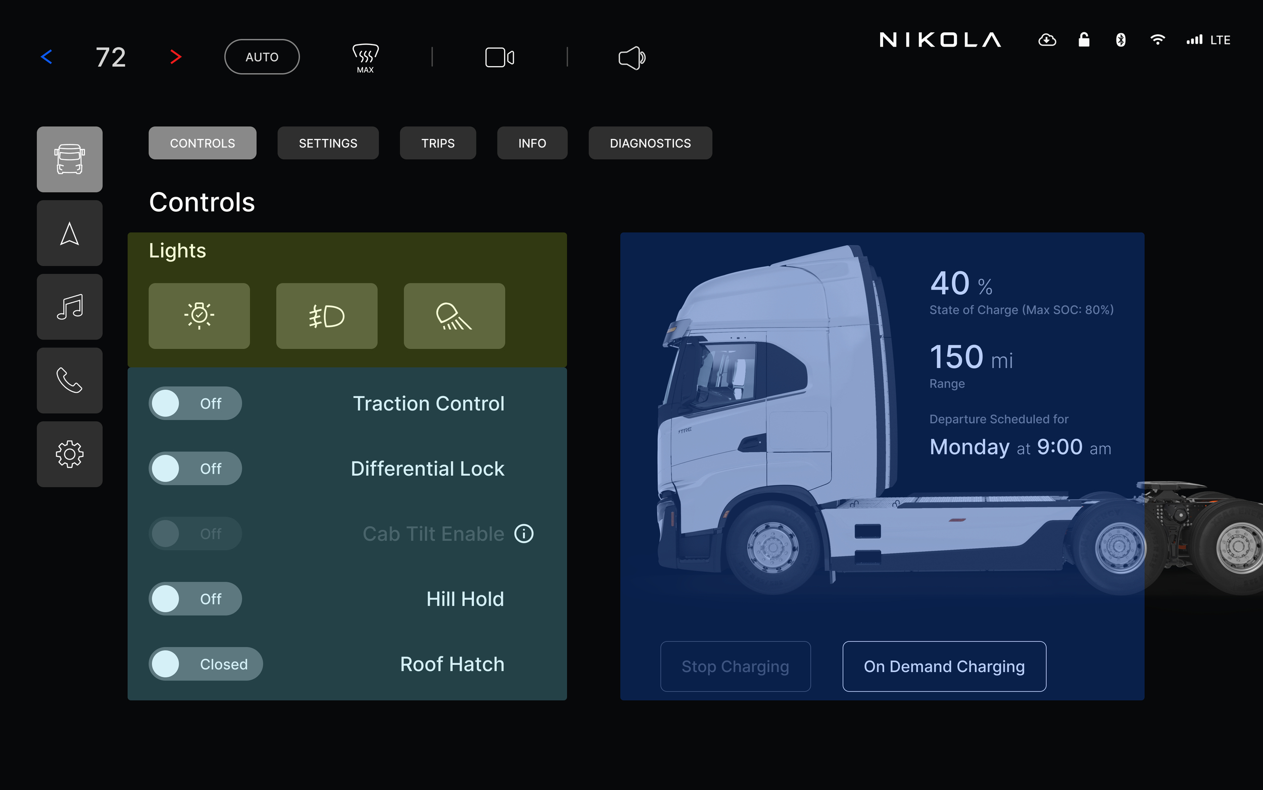

To make better use of screen space, I introduced layers that prioritized frequently used controls, ensuring they were always accessible, even during critical moments, regardless of the page the driver had open. In discussions with drivers, HVAC controls consistently emerged as the top concern—not only for accessibility but also ease of use. Drivers needed quick access to HVAC controls without taking their eyes off the road, and many reported difficulty using the controls, especially with dirty hands or while wearing gloves. This insight drove the design to ensure HVAC controls were both easily reachable and simple to operate in any condition.


ACCESSIBILITY
By utilizing the full screen real estate, we can proportionally enlarge font sizes and touch targets, making buttons more accessible and easier to interact with. This enhancement not only improves readability but also creates a safer, more intuitive experience for the driver, reducing distractions and ensuring smoother, more confident interactions on the road.
SCalability
As part of our redesign effort, we prioritized designing for scalability to ensure the interface could evolve alongside the rapid advancements in automotive technology. Looking ahead to next-gen development, we understood that scalability would be essential for supporting emerging innovations like autonomous driving, AI-driven systems, and enhanced connectivity features. By designing with scalability in mind, we not only future-proofed the interface but also allowed manufacturers to remain adaptable to changing trends and needs. This approach ensures a sustainable solution that will continue to meet the demands of both drivers and the automotive industry well into the future.
